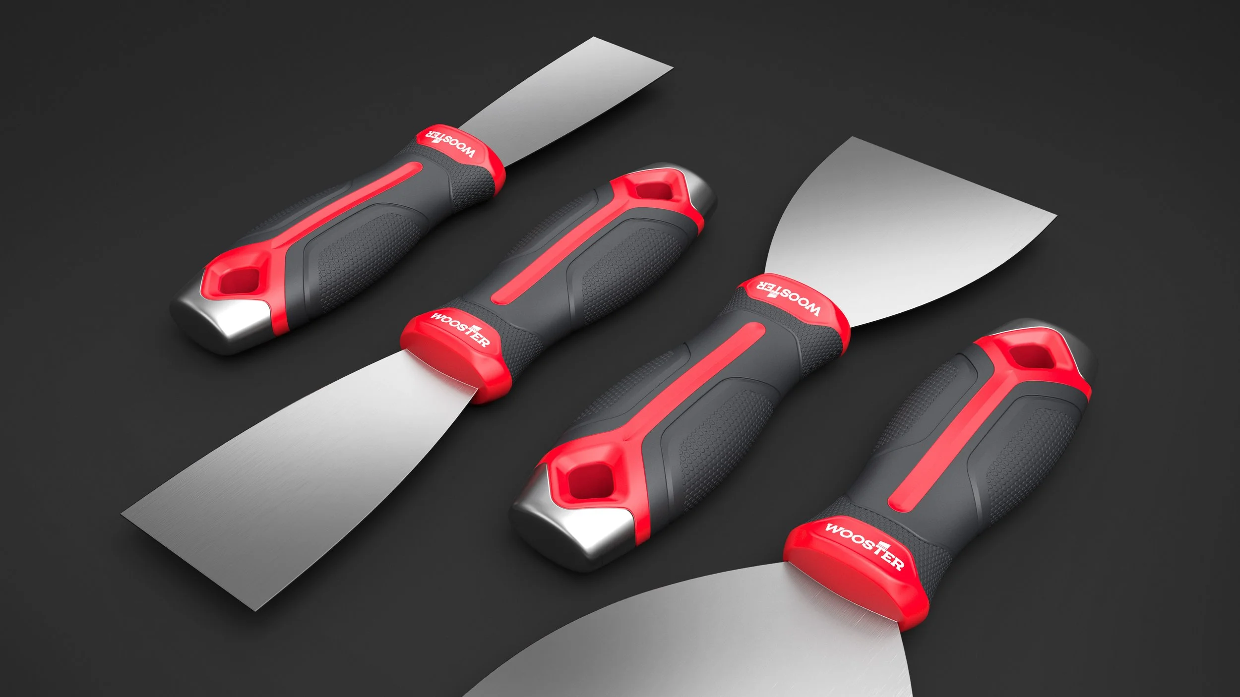
Wooster Brush VBL
For Pros and DIYers
The project began with a clear goal to develop a cohesive Visual Brand Language strategy for the Wooster Brush Company, one that would unify its diverse product line and resonate with both professional painters and DIY enthusiasts.
With a legacy of trusted products, Wooster needed more than a visual refresh; it needed a VBL that honored tradition while embracing the future. Professionals favored bold, power-tool-inspired aesthetics in form, texture, and grip, while DIY users preferred softer, more approachable cues. This contrast was especially clear in color. Forest Green, a symbol of quality and reliability for professionals, didn’t fit Wooster’s broader vision for a unified product palette.
Balancing these opposing needs meant thinking strategically about every detail, from surface finishes and silhouettes to molded-in graphics and subtle branding cues. The final VBL strategy harmonized these elements, allowing Wooster’s tools to feel powerful yet approachable, professional yet inclusive. Through thoughtful design decisions and sensitivity towards user perception, the new VBL not only elevated Wooster’s brand presence, it created a visual thread that connects every product to the company’s legacy of craftsmanship and innovation.
Client
Wooster Brush Company
Services
Industrial Design
Visualization & Product Rendering
Visual Brand Language Development


See Also